MAKE / MUSIC VISUALS
Plan a visualizer around the artwork, then test the export
Plan music visuals in Orpheus, with separate compositions for landscape, square and vertical video.
3 min read
Begin with a layout brief · Separate artwork from the motion layer · Make three compositions rather than three crops
By Aurorabyss Designs · Updated November 6, 2026
Begin with a layout brief
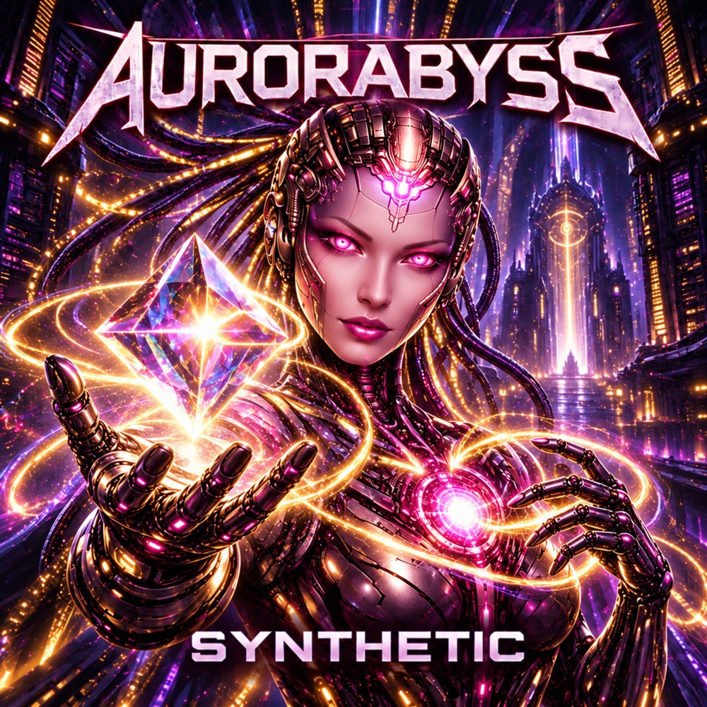
An album cover is usually designed as a square. A video destination may expect a wide frame or a tall phone screen. Stretching the cover to fill the new shape can distort lettering and remove the very details that identify the release. Before opening a project, decide which part of the artwork must remain visible, where the artist and track names belong, and which destination you are preparing for.
Our Orpheus catalog lists landscape, square, and vertical output, artwork animation, and several spectrum styles. Those are layout options, not a reason to put every effect into one video. Write a brief with four items: destination, frame shape, primary image, and essential text. Use only audio, artwork, fonts, and other material you have permission to publish.
Separate artwork from the motion layer
Think of the cover as the identity layer and the waveform or spectrum as the motion layer. If a bar display runs across small title text, the two layers compete for the same space. Try placing motion below the cover in a wide layout, or behind a quiet area of the background. Preview both a calm passage and a loud passage; the largest motion may hide text that was clear at the start.
The available visualizer styles include bars, waveform, radial, centered, and dual-tower spectrum. Choose by the space left in your layout. A radial display needs room around its center, while a horizontal waveform can work in a narrow band. These are composition suggestions, not claims that a particular style matches a genre or improves audience response.
Make three compositions rather than three crops
In landscape, a square cover can sit beside the title block. In square, the same cover may become the center of the composition with smaller motion around it. In vertical, stack the elements and reserve clear space for the track identity. Keep text away from the extreme edges, where player controls or destination overlays may cover it.
Check the result at the size people will actually see. Read the artist and track names on a phone-sized preview without zooming. If the text is too small, simplify it before making the whole composition larger. A useful cover detail can stay in the image even when it is too small to serve as the only title text.
Review a short render before the full track
Check the formats and frame rates offered by your current Orpheus build, then compare them with the destination’s current requirements. A file extension alone does not tell you whether a destination accepts every encoding inside it.
Render a short representative section and watch the exported file, not only the application preview. Check audio start and end, unexpected silence, clipping of artwork, text legibility, motion covering labels, and whether the file opens in the intended player. Higher frame rate is not a substitute for readable layout or clean audio.
Keep a reproducible handoff
Name the outputs by release, destination, and shape. Keep the source artwork and audio separate from the rendered delivery files so a revision does not overwrite your master assets. Record the app version and export choices with the project. When you change a layout, rerender the short test before committing to the full-length export.
The Apps page links to the official release listing and describes current availability. This workflow is an editorial planning resource based on those published features; it does not imply that we tested every device, export format, or upload destination.
Keep exploring
Build a first deck you can actually learn from →
A listening map of the Aurorabyss roster →